|
Got a thin skin? Then look elsewhere. Post a link to an image that you've made, and invite others to offer their critiques. Honesty is encouraged, but please be positive in your constructive criticism. Flaming and just plain nastiness will not be tolerated. Please note that this is not an area for you to showcase your images, nor is this a place for you to show-off where you have been. This is an area for you to post images so that you may share with us a technique that you have mastered, or are trying to master. Typically, no more than about four images should be posted in any one post or thread, and the maximum size of any side of any image should not exceed 950 px.
Moderators: Greg B, Nnnnsic, Geoff, Glen, gstark, Moderators
Forum rules
Please note that image critiquing is a matter of give and take: if you post images for critique, and you then expect to receive criticism, then it is also reasonable, fair and appropriate that, in return, you post your critique of the images of other members here as a matter of courtesy. So please do offer your critique of the images of others; your opinion is important, and will help everyone here enjoy their visit to far greater extent.
Also please note that, unless you state something to the contrary, other members might attempt to repost your image with their own post processing applied. We see this as an acceptable form of critique, but should you prefer that others not modify your work, this is perfectly ok, and you should state this, either within your post, or within your signature.
Images posted here should conform with the general forum guidelines. Image sizes should not exceed 950 pixels along the largest side (height or width) and typically no more than four images per post or thread.
Please also ensure that you have a meaningful location included in your profile. Please refer to the FAQ for details of what "meaningful" is.
 by firsty on Sun Jun 28, 2009 1:18 am by firsty on Sun Jun 28, 2009 1:18 am
I have been a bit slack, not posting much here although I visit fairly often... can we all say "lurker" so without further ado was out at eastern creek a few weeks ago taking shots of the bikes when I remembers some saying on this forum that "motor sport images are suppose to be over saturated and vibrant" Have I gone to far 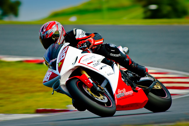 I think yes  then for something different it was a cloudy day, but the cloud bank stopped short of the horizon and during the last race of the sun dropped below the clouds just before it set and from where I was shooting I was looking straight into the sun and it was reflecting off the track... aahh moment... back lit near silhouette metering of the track reflection to stop any blown highlights I started panning... black frame, black frame, black frame, front wheel in the glow, back wheel in the glow, black frame it took about 10 panning burst before I caught a full bike in the glow and only managed two full images in about 100 frames before the race was over 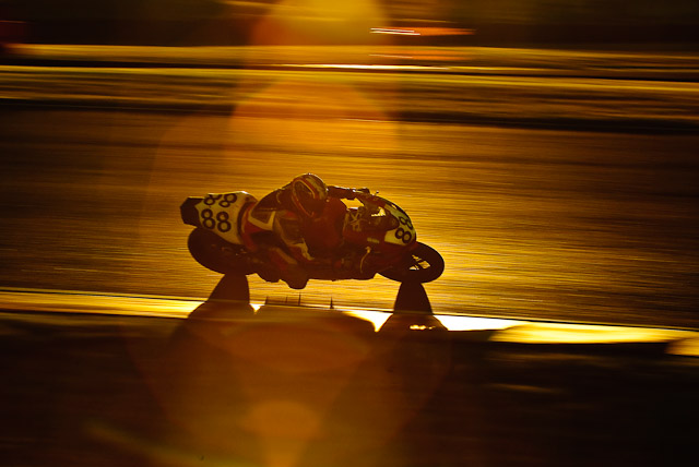 definitely something I will have to try again. all comment and suggestions on ways to improve both these images is most appreciated
-

firsty
- Senior Member
-
- Posts: 581
- Joined: Tue Jan 10, 2006 12:34 am
- Location: Baulkham Hills Sydney - D200
by surenj on Sun Jun 28, 2009 2:27 am
While I like the first, the second is an absolute corker!! Masterful!!
-

surenj
- Senior Member
-
- Posts: 7197
- Joined: Fri Sep 15, 2006 8:21 pm
- Location: Artarmon NSW
by Mitchell on Sun Jun 28, 2009 8:12 am
surenj wrote:the second is an absolute corker!!
couldn't agree more. it was worth the repetition - the mood of this image is spot on. nice work firsty!
-

Mitchell
- Member
-
- Posts: 238
- Joined: Tue Feb 07, 2006 3:16 am
- Location: Île Saint Louis, Paris
-
by colin_12 on Sun Jun 28, 2009 9:55 am
I think you have gone a bit far on the 1st.
The second is a fantastic effort.
Way to go firsty.
Regards Colin
Cameras, lenses and a lust for life
-

colin_12
- Senior Member
-
- Posts: 1853
- Joined: Thu Jan 04, 2007 7:10 pm
- Location: Hazelbrook
by gstark on Sun Jun 28, 2009 10:51 am
colin_12 wrote:I think you have gone a bit far on the 1st.
The second is a fantastic effort.
Way to go firsty.
 But it's fun trying, right? g.
Gary Stark
Nikon, Canon, Bronica .... stuff
The people who want English to be the official language of the United States are uncomfortable with their leaders being fluent in it - US Pres. Bartlet
-

gstark
- Site Admin
-
- Posts: 22924
- Joined: Thu Aug 05, 2004 11:41 pm
- Location: Bondi, NSW
by ozczecho on Sun Jun 28, 2009 3:30 pm
Legend....#2 is awesome/
-

ozczecho
- Senior Member
-
- Posts: 785
- Joined: Sun Mar 13, 2005 9:41 pm
- Location: Beecroft, Sydney
by biggerry on Sun Jun 28, 2009 6:33 pm
Have I gone to far
if you have, its not by much imo - the image looks like a typical mag shot The second image is great! a different take on motosport imagery and you have made it look easy!  top work.
-

biggerry
- Senior Member
-
- Posts: 5930
- Joined: Tue May 13, 2008 12:40 am
- Location: Under the flight path, Newtown, Sydney
-
by aim54x on Sun Jun 28, 2009 10:54 pm
I will have to be boring and say that the second is absolutely amazing!!
Cameron Nikon F/Nikon 1 | Hasselblad V/XPAN| Leica M/LTM |Sony α/FE/E/Maxxum/M42Wishlist Nikkor 24/85 f/1.4| Fuji Natura BlackScout-Images | Flickr | 365Project
-

aim54x
- Senior Member
-
- Posts: 7305
- Joined: Fri Feb 01, 2008 10:13 pm
- Location: Penshurst, Sydney
-
by CraigVTR on Mon Jun 29, 2009 8:35 am
# 2 is great well worth the effort.
#1 the saturation on the bike is great but I think the background is a little overpowering. If you desat the background a touch it will be just right.
Craig
Lifes journey is not to arrive at our grave in a well preserved body but, rather to skid in sideways, totally worn out, shouting, "Wow what a ride."
D70s, D300, 70-300ED, 18-70 Kit Lens, Nikkor 105 Micro. Manfrotto 190Prob Ball head. SB800 x 2.
-

CraigVTR
- Senior Member
-
- Posts: 1243
- Joined: Fri Feb 03, 2006 6:09 pm
- Location: Montville, Sunshine Coast, Queensland
-
by mikecarlotto on Mon Jun 29, 2009 1:18 pm
Both shots are great but I'd tone down the 1st a little. Top stuff!
-
mikecarlotto
- Newbie
-
- Posts: 19
- Joined: Fri Jan 16, 2009 6:18 pm
- Location: Fairfield, Brisbane, QLD
by ian.bertram on Tue Jun 30, 2009 8:45 pm
I absolutely love your second image. It just makes me want to get back on a bike again. There's something evocative about the image that makes the rider look all alone in a world of their own. Have you thought about slightly cropping in? Probably not much but just enough to bring the bike in a little closer. A really nice effect and one I want to try myself.
-

ian.bertram
- Member
-
- Posts: 188
- Joined: Sat Jun 27, 2009 7:35 pm
- Location: Panania, South Western Sydney, NSW
-
by methd on Sun Jul 05, 2009 9:12 am
The second would be even more perfect if his knees were down 
-

methd
- Member
-
- Posts: 483
- Joined: Wed Feb 21, 2007 9:12 pm
- Location: Melbourne, VIC.
Return to Image Reviews and Critiques
|
